

A high-converting healthcare landing page puts one patient-focused call to action above the fold, proves trust within the first 3 to 7 seconds, and removes every field, click, or claim that doesn't serve that single goal. Everything else, from imagery to page speed, exists to support that one action.
If your landing page tries to explain your whole practice, book three service lines, and collect a newsletter signup on the same screen, it will underperform pages that do one thing well. That's the pattern across nearly every well-performing healthcare landing page: a narrow promise, a visible next step, and evidence the patient can trust the source before they hand over their information.
Here's what needs to be above the fold, without exception:
- A headline stating the specific outcome or service, not your practice's mission statement
- One primary CTA, worded as an action ("Book Your Consult," "Call Now"), with zero competing buttons
- A trust signal visible without scrolling, such as a clinician credential, patient rating, or accreditation mark
- A direct contact method: phone number as a tappable link, and/or a short form
- Layout built mobile-first, since most visitors will land on a phone screen, not a desktop monitor
If you only have an hour this week, do this in order:
- Rewrite your headline to name the patient outcome, not your organization's name.
- Cut every landing page down to one CTA, and match that CTA's wording to whatever your ad or referral link promised.
- Add a phone number formatted as a click-to-call link and confirm your form loads correctly on a phone.
Key Takeaways
A healthcare landing page converts best when it has one clear CTA, visible trust signals, mobile-first design, and tracking tied to booked appointments rather than raw traffic.
| Point | Details |
|---|---|
| Audit headline and CTA | Rewrite the headline around patient outcome and cut every page to a single CTA within 48 hours. |
| Fix mobile experience first | Test forms and tap targets on an actual phone, since mobile drives most healthcare site traffic. |
| Add a trust signal above the fold | Place a clinician credential, rating, or accreditation mark near the CTA, not just in a footer. |
| Map tracking to real outcomes | Set analytics events for booked appointments and phone calls, not just form submissions. |
| Run two A/B tests this quarter | Start with headline wording and form length, the two highest-impact, lowest-effort changes. |
| Consider performance-based support | Zensweb ties its patient acquisition and AI visibility work to booked appointment results rather than flat fees. |
Table of Contents
- Annotated Healthcare Landing Page Examples and Why They Convert
- Checklist: Must-Have Elements for Effective Healthcare Landing Pages
- What Design Choices Actually Increase Conversions?
- How Do You Optimize a Healthcare Landing Page for Search and AI Visibility?
- What Privacy and Compliance Rules Apply to Healthcare Landing Pages?
- How Do You Test and Improve Landing Page Performance Over Time?
- Reusable Wireframes for Common Healthcare Landing Page Goals
- How Long Does It Take and What Does It Cost to Launch One?
- What Separates a Good Healthcare Landing Page From a Great One?
- Get Landing Pages That Actually Book Patients, Not Just Traffic
- Sources
Annotated Healthcare Landing Page Examples and Why They Convert
The fastest way to fix a weak landing page is to study one that already works and reverse engineer the choices behind it. Below are eight common healthcare landing page types, described generically so you can copy the pattern without ripping off any single vendor's design.
1. Single-specialty service page (e.g., orthopedic knee consult). The hero section names the exact procedure or condition, not "orthopedic services." Below it, a short paragraph states what happens in the first visit. The lesson: specificity beats breadth every time a patient is searching for relief from one specific problem.
2. Urgent care wait-time page. The headline leads with current or typical wait time, and the CTA reads "Check In Online" instead of a generic "Contact Us." The urgency is real, not manufactured, and the CTA language matches the visitor's actual intent: skip the line, not learn about the clinic.
3. Telehealth consult landing page. These pages typically show a clinician's face near the CTA, since patients hesitate more before a virtual visit than an in-person one. The microcopy under the button often reads something like "See a provider today, no office visit required," directly answering the objection a first-time telehealth user has in their head.
4. Screening or awareness campaign page (e.g., mammography, colon cancer screening). These pages lean on statistics and a low-commitment CTA like "Check If You Qualify" rather than "Schedule Now." The lesson: screening campaigns convert better with a soft first step, since the visitor often hasn't decided to book yet.
5. CME or provider registration page. Trust signals shift here from patient testimonials to accreditation bodies and credentialing details, since the audience is other clinicians, not patients.
6. Device or DME request page (durable medical equipment). These typically use a short, benefit-first headline ("Get Your CPAP Supplies Delivered") and remove almost all copy beneath the fold, since the audience already knows what they need.
7. Behavioral health intake page. Privacy language appears earlier and more prominently than on other page types, often right beside the CTA, because confidentiality is the top objection for this audience.
8. Multi-location practice landing page. These pages use a location-selector or auto-detected address near the top, since the primary decision point is proximity, not service quality.
| Page Type | Primary Goal | Main CTA | Trust Signal Used |
|---|---|---|---|
| Specialty service | Book consult | "Schedule a Consult" | Clinician bio and credentials |
| Urgent care | Reduce perceived wait | "Check In Online" | Live wait time, ratings |
| Telehealth | Start virtual visit | "See a Provider Today" | Clinician photo, licensure |
| Screening campaign | Soft-qualify lead | "Check If You Qualify" | Statistics, screening guidelines |
| Behavioral health | Reduce hesitation | "Request a Confidential Call" | Privacy statement, credentials |
Across these examples, the trust elements that show up again and again are clinician credentials, real patient ratings, and accreditation marks, often placed within the first screen rather than buried in a footer, underscoring the important role of patient testimonials in healthcare trust. Collecting and surfacing genuine patient reviews does more for conversion than another paragraph of marketing copy.
Pro Tip: Before you copy any layout wholesale, test just the CTA wording first. Swapping "Contact Us" for "Book Your Consult" is a five-minute change that often moves the needle more than a full redesign, and it tells you where to focus your next round of work.
Checklist: Must-Have Elements for Effective Healthcare Landing Pages
Every high-converting page you'll find shares a short list of non-negotiable elements. Run your existing pages against this list before you touch anything else.
- Headline that states the patient's gain, not your practice name (e.g., "Back Pain Relief in 2 Visits or Less" beats "Welcome to Riverside Orthopedics")
- Subhead that answers "what happens next" in one sentence, reducing the anxiety of the unknown
- One primary CTA, worded as an action: "Book Your Consult," "Call (555) 123-4567," or "Request a Callback"
- Trust signals placed near the CTA, not just in a testimonials section at the bottom: clinician credentials, board certifications, star ratings
- Short privacy or urgency microcopy directly under the form, such as "Your information is kept confidential" or "Limited appointments available this week"
- A form asking for the minimum information needed to schedule, not a full intake form
Effective microcopy tends to be shorter than marketers expect. "We'll call you within one business hour" builds more confidence than a paragraph explaining your scheduling process. A one-line privacy note ("We never share your information") next to a form field reduces drop-off more reliably than a link to a full privacy policy nobody reads before submitting.
Pro Tip: Use progressive disclosure on longer forms. Ask for name and phone number first, then reveal insurance or symptom questions only after that first field is filled. Shorter initial forms consistently outperform long ones because the visitor commits before seeing the full ask.
What Design Choices Actually Increase Conversions?
Layout decisions should follow the specific goal of the page, not a generic template. A page built to book an appointment needs a different structure than one built to capture a lead for a screening campaign or a webinar signup.
For appointment booking, put the CTA and phone number in the first screen and repeat the CTA once more after any supporting content. For a triage or lead-capture goal, where the visitor may not be ready to commit to booking, a shorter, lower-commitment form works better, something like a callback request instead of a full appointment form. For webinar or CME signups, the priority shifts to credentialing and topic relevance rather than urgency.
Imagery matters more than most healthcare marketers assume. Stock photos of generic smiling models tend to underperform real clinician photos or short video introductions, since patients are looking for a human they can trust with a health decision, not an ad. A 30 to 60 second clinician-led video answering the top patient question for that service line often outperforms a paragraph of text, provided it includes captions for accessibility and doesn't autoplay with sound.

Form design deserves its own attention. Ask for name and phone number first; save insurance details, symptoms, or date-of-birth for later steps or a follow-up call. On mobile, number pads should auto-trigger for phone fields, and every input needs to be large enough to tap accurately with a thumb. Always include a visible phone number as a fallback, since a share of visitors will bail on a form entirely and prefer to call.
Mobile UX deserves specific attention given how much traffic now arrives on a phone:
- Keep tap targets at least 44 by 44 pixels so buttons don't require a second attempt
- Use a sticky CTA bar that stays visible as the visitor scrolls
- Pre-fill fields when possible using UTM or ad-click data to reduce typing
- Make the phone number a tappable link, not just plain text
Accessibility isn't optional for a healthcare audience, many of whom are older or managing a condition that affects vision, mobility, or cognition. At minimum, every image needs descriptive alt text, color contrast should meet WCAG standards for text against background, and the entire form and CTA flow needs to work with keyboard navigation alone, not just a mouse or touchscreen.
Pro Tip: Test your own landing page using only a keyboard, no mouse. If you can't reach and submit the form using Tab and Enter, a share of your visitors using assistive technology can't either.
How Do You Optimize a Healthcare Landing Page for Search and AI Visibility?
Technical SEO for a landing page starts with basics that get skipped surprisingly often: a unique title tag naming the service and location, a meta description that states the outcome in plain language, and a single H1 that matches search intent rather than internal branding language.
A workable title template looks like this: "[Service] in [City] | [Practice Name]." Pair it with schema markup using MedicalBusiness or Physician schema types, along with Service schema describing exactly what the page offers. Structured data helps search engines and AI answer engines understand what your page actually does, which matters more now that patients are asking ChatGPT and Perplexity health questions directly instead of typing them into a search bar.
Getting cited inside an AI-generated answer depends heavily on content that reads as authoritative and clinician-reviewed, not generic marketing copy. Pages that include a short clinician-attributed block, "Reviewed by Dr. [Name], board-certified in [specialty]," tend to carry more weight with both human visitors and AI search systems evaluating trustworthiness. Building that kind of visibility deliberately, across ChatGPT and Claude as well as traditional search, is quickly becoming part of the baseline for healthcare digital marketing rather than an experiment.
Tracking needs to map to real outcomes, not vanity metrics. Set up analytics events for the actions that actually matter: booked appointment confirmations, phone calls initiated from the page, form submissions, and verified patient reach where that data is available. A form submission alone tells you almost nothing if you can't connect it to whether that lead became a booked, kept appointment.
Mobile traffic now makes up a large share of web visits in the U.S., according to Statista, which means a landing page that loads slowly or renders poorly on a phone is losing most of its potential visitors before they ever see the CTA.
What Privacy and Compliance Rules Apply to Healthcare Landing Pages?
Every form on a healthcare landing page is a potential compliance risk if it's not built with patient data protection in mind from the start. The safest approach is to collect the minimum information needed to schedule a first contact, name, phone number, and reason for visit at most, and route anything more sensitive to a secure, authenticated portal rather than a public web form.
Run through this before launch:
- Confirm your form vendor will sign a Business Associate Agreement if any field could capture protected health information
- Avoid asking for diagnosis details, medications, or insurance member IDs on the public-facing form
- Use HIPAA-aware form design practices that separate general inquiry fields from anything touching PHI
- Route sensitive follow-up communication to secure messaging, not standard email
Cookie consent and tracking purposes need the same scrutiny. Standard advertising pixels that fire on every page load can inadvertently tie a patient's identity to a visit for a sensitive condition page, which creates real privacy exposure. Aligning your cookie categories with TCF purpose definitions and disabling pixel-level tracking on pages tied to sensitive diagnoses (behavioral health, reproductive care, HIV services) is a reasonable default rather than an edge case.
Pro Tip: When comparing consent management platforms, ask each vendor directly whether they support server-side tagging and whether they'll sign a BAA. A OneTrust or Cookiebot comparison built around those two questions will eliminate most unsuitable vendors immediately.
Passing leads safely into your CRM or booking system means stripping unnecessary identifiers before the data leaves your form vendor, and confirming your booking platform doesn't log full form contents in a plaintext export anyone on staff can access. A privacy portal that centralizes consent choices makes this easier to document and audit later, which matters if a patient ever asks what data you hold on them.
Privacy-first measurement isn't just a compliance checkbox. Server-side and consent-based tracking tends to filter out bot traffic and low-quality leads more effectively than client-side pixels alone, which means the lead volume you do see is more likely to convert into an actual booked appointment.
How Do You Test and Improve Landing Page Performance Over Time?
A landing page is never finished. The pages that keep improving are the ones with a repeatable testing process behind them, not a one-time launch followed by neglect.
- Identify one clear objective for the test: more form submissions, more phone calls, or a lower cost per booked appointment.
- Pick a single high-impact hypothesis rather than testing five variables at once. Headline wording and CTA phrasing tend to produce the biggest early wins.
- Run the A/B test with enough traffic to reach a meaningful sample size before calling a winner. Low-traffic pages may need several weeks to gather enough data.
- Analyze results against your actual KPI, not just click-through rate on the button.
- Roll out the winning version and immediately queue the next hypothesis.
Prioritize these KPIs over generic traffic metrics:
- Cost per booked appointment (not just cost per lead)
- Verified booked rate, meaning leads that actually converted into a kept appointment
- Phone-to-book rate for calls generated by the page
- Click-to-call conversion rate on mobile specifically
Strong first hypotheses to test include swapping a generic headline for a benefit-specific one, changing CTA language from "Learn More" to a direct action verb, shortening a form from six fields to three, and moving a trust signal from the bottom of the page to directly beside the CTA.
Give each test enough runway to account for day-of-week and seasonal variation. A test that only runs Monday through Wednesday will skew results if your patient volume differs meaningfully on weekends. Watching a session recording or adding a one-question on-page survey ("What almost stopped you from booking today?") often explains a confusing A/B result faster than staring at the numbers alone. B2B healthcare marketers consistently name measurement gaps as a top operational challenge, which makes a disciplined testing habit a genuine differentiator, not just good practice.
Reusable Wireframes for Common Healthcare Landing Page Goals
Three structures cover most healthcare landing page needs. Adapt the section order to your specialty, but don't skip a section without a reason.
Wireframe A: Single-service booking page
- Headline naming the specific service and outcome
- Primary CTA and phone number, both visible without scrolling
- Short clinician bio with credential and photo
- Two to three sentence explanation of what the visit involves
- Patient rating or testimonial snippet
- Repeated CTA at the bottom
Wireframe B: Screening or campaign lead magnet
- Headline built around risk or eligibility ("Find Out If You Qualify for Free Screening")
- Short statistic or guideline reference to build urgency
- Low-commitment CTA ("Check Eligibility") rather than a full booking form
- Trust signal from a recognized health authority or accreditation
Wireframe C: Telehealth consult signup
- Headline emphasizing convenience and speed
- Clinician photo or short video near the CTA
- Form asking only for name, phone, and preferred time
- Privacy microcopy addressing the confidentiality objection directly
Six CTA variations worth testing across these wireframes, mapped to intent:
- "Book Your Consult Today" (general booking)
- "Call Now, We're Open" (urgency, urgent care)
- "See a Doctor in Minutes" (telehealth convenience)
- "Check If You Qualify" (screening, soft commitment)
- "Request a Confidential Callback" (behavioral health, sensitive topics)
- "Talk to a Specialist" (specialist consult, higher acuity)
A benefit-focused hero paragraph might read: "Most patients see meaningful relief within two visits. Book a consult today and get a personalized plan from a board-certified specialist." Pair that with a one-line privacy note under any form: "Your information stays private and is never shared without your consent." Prebuilt medical landing page templates can speed up the build, but every template still needs real adaptation for local SEO signals (city and neighborhood names, local schema) and specialty-specific trust elements before it's ready to publish.
How Long Does It Take and What Does It Cost to Launch One?
Timelines and costs vary widely depending on whether you're building internally with existing staff or hiring outside help, and whether the page needs custom video, integrations, or a HIPAA-certified vendor stack.
| Phase | Lean Build | Full-Featured Build |
|---|---|---|
| Strategy and copy | 2 to 4 days | 1 to 2 weeks |
| Design | 3 to 5 days | 1 to 3 weeks |
| Development | 3 to 7 days | 2 to 4 weeks |
| QA and compliance review | 1 to 2 days | 3 to 5 days |
| Launch and tracking setup | 1 day | 2 to 3 days |
A lean build using an existing template and internal staff time can realistically launch inside two to three weeks. A full-featured build with custom clinician video, multiple integrations, and a dedicated compliance review often runs six to eight weeks from kickoff to launch.
Cost drivers that push a project toward the higher end include custom video production, integration with a specialty CRM or booking platform, HIPAA-certified form or analytics vendor fees, and any multi-language or multi-location build requiring several page variants.
Before launch, confirm every item on this list:
- Privacy policy link and consent banner are live and functioning
- Schema markup validates without errors
- Page renders correctly on at least three phone screen sizes
- Every form field is keyboard-accessible
- Analytics events fire correctly for form submission and click-to-call
What Separates a Good Healthcare Landing Page From a Great One?
Most healthcare landing pages fail for organizational reasons, not design reasons. The copy gets written by a marketing team, the clinical accuracy gets checked (if at all) after launch, and nobody owns the measurement loop that tells you whether the page is actually producing booked patients or just form submissions that go nowhere. Fixing that sequence, clinician review before launch, not after, matters more than any headline test.
The teams that consistently improve their pages treat clinician review as a standing part of the workflow, not a one-time sign-off. A specialist glancing at a draft for five minutes before publish catches phrasing that sounds like marketing overreach to a patient who knows their own condition well. That single habit prevents more trust erosion than any design tweak fixes after the fact.

The other recurring failure is measurement theater: dashboards full of clicks and impressions with no line connecting a lead to a kept appointment. A practice that can't answer "what did this page cost us per booked patient" is optimizing blind, no matter how polished the page looks.
AI search visibility is quietly rewriting the priority list here too. A landing page that used to compete only against other search results on a results page now needs to hold up as a source an AI answer engine might cite directly to a patient asking a health question in plain language. That shifts weight toward clinician-attributed content blocks and structured data, and away from purely persuasive ad copy, since the audience reading it may include an AI system deciding whether to surface your practice at all.
Get Landing Pages That Actually Book Patients, Not Just Traffic
Zensweb exists for the gap most healthcare marketing vendors leave open: building a well-designed landing page is only half the job if nobody's checking whether it's actually producing booked, kept appointments. Zensweb runs on a performance-based model, meaning payment ties to results like booked appointments, not hours billed or pages shipped.
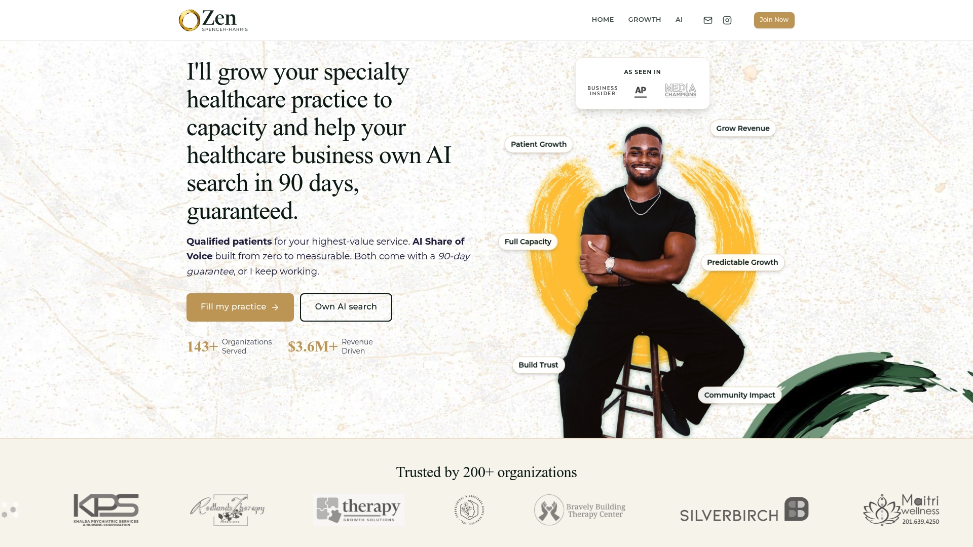
That includes the AI Share of Voice work behind getting a practice visible on ChatGPT, Claude, Perplexity, and Google within 90 days, so the landing pages you build off this checklist actually get found by patients asking AI tools health questions directly. The patient acquisition service covers everything from the landing page itself through tracking setup and clinician-reviewed content, and the broader service lineup includes technical SEO, structured data, and reputation building for practices that need more than a single page fixed.
If you want a clear look at where your current pages are leaking bookings before committing to anything, start with a free healthcare audit. It's a low-friction way to see exactly what's costing you patients right now.
Sources
- Share of website traffic coming from mobile devices in the United States
- Healthcare Digital Marketing Trends & Growth 2026 | G&CO.
- OneTrust privacy portal webform